Mixing wood tones works best when the room has one dominant wood, a limited number of supporting tones, and a repeated visual relationship between them. You do not need every floor, table, cabinet, and frame to match. In many rooms, controlled variation looks more natural than a perfectly matched furniture set.
TL;DR: Identify the dominant wood, compare warm and cool undertones, repeat each supporting tone at least twice when possible, vary grain scale, use textiles and painted surfaces as visual breaks, and judge the mix in the room's actual lighting before committing.
Gather Samples and Prep the Room First
Before comparing finishes, gather photos or physical wood samples, a white sheet of paper for neutral comparison, painter's tape for temporary placement, and photos of fixed flooring or cabinetry. Check samples in daylight and evening light. If you are applying stain or finish yourself, follow the product's ventilation, fire-safety, and protective-equipment instructions.
First Separate Wood Species From Wood Tone
Wood species, stain color, grain pattern, finish sheen, and age all affect appearance. Two pieces made from the same species may look different after staining, while different species can look surprisingly compatible when their undertones relate.
The American Hardwood Information Center species guide shows how hardwood species vary in natural color, grain, and appearance under different finishes. Its broader guide to wood types also emphasizes that species have distinct grain patterns, textures, colors, and physical properties. Those are factual material differences. Deciding which combination looks "best," however, is a design preference rather than an objective rule.
Step 1: Identify the Dominant Wood in the Room
Start with the largest fixed or visually powerful wood surface. This may be flooring, kitchen cabinetry, a paneled wall, a large dining table, or built-in shelving. Treat that element as the anchor rather than trying to make every new purchase match it exactly.
If a room has oak flooring, for example, you can introduce walnut, painted furniture, or a different oak finish as long as the overall relationship feels intentional. The dominant wood should appear stable enough that supporting pieces look selected around it rather than accidentally collected.
This approach is similar to organizing other visual systems in the home. When you organize a pantry so it stays organized, a few clear zones create order. In a room, a dominant tone performs a similar anchoring role.
Step 2: Compare Undertones Before Exact Color
Instead of asking whether two woods are the same shade, ask whether they lean warm, cool, or relatively neutral.
Warm-looking woods and finishes often show honey, amber, orange, red, or golden notes. Cooler appearances may lean gray, taupe, ashy brown, or muted brown. Neutral medium-brown tones can bridge both groups.
You do not need perfect undertone agreement. High contrast can be attractive. The key is to avoid a combination that looks almost matched but slightly wrong, especially when two medium-brown pieces sit directly beside each other.
A useful test is to place samples or photos side by side in the room and look at them in morning, afternoon, and evening light. Artificial lighting can shift the apparent warmth of both wood and surrounding paint.
Step 3: Limit the Number of Main Wood Families
Most rooms become easier to read when two or three wood families do most of the work. That does not mean every small frame or accessory must fit the rule. It means the largest pieces should create a clear pattern.
| Room Condition | Practical Direction | Why It Often Works |
|---|---|---|
| Light wood floor | Add one medium or dark wood plus painted pieces | Creates contrast without crowding the palette |
| Dark built-ins | Use lighter wood furniture and soft textiles | Prevents the room from feeling visually heavy |
| Mixed inherited furniture | Repeat one shared undertone with new pieces | Helps unrelated pieces feel connected |
| Open-plan room | Carry at least one wood tone between zones | Creates continuity across separate functions |
These are design strategies, not universal requirements. Personal taste, architecture, available furniture, and lighting can justify very different choices.
Step 4: Repeat Supporting Tones
A single dark walnut side table in a pale-oak room can look isolated. Add a second, smaller echo of that dark tone through a frame, lamp base, chair legs, or shelf and it usually reads as more deliberate.
The repeated element does not have to be the same species. What matters visually is that the color family or weight appears again. Repetition is especially useful in open-plan homes, where a wood tone in the dining area can be echoed in the living area.
Step 5: Vary Grain Scale as Well as Color
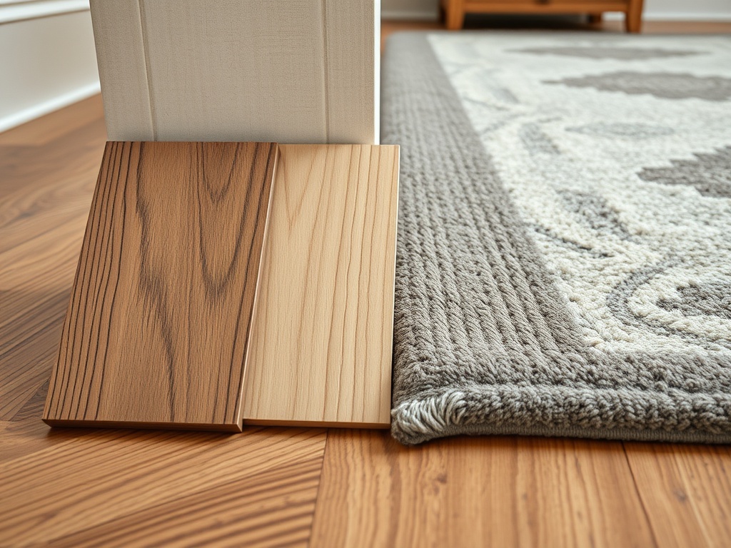
Color gets most of the attention, but grain can be equally important. A room filled with several highly figured woods may feel busy even if the colors coordinate. Pairing one expressive grain with quieter surfaces often gives the eye a place to rest.
Open-grain woods such as oak and ash can read differently from tighter-grain species even under similar finishes. The American Hardwood Information Center's finishing overview explains that wood structure affects how stains and colorants behave. For homeowners, the practical lesson is to compare finished samples rather than relying only on the species name.
Step 6: Use Non-Wood Materials as Visual Breathing Room
Rugs, upholstered furniture, painted cabinetry, stone, metal, glass, and wall color can stop multiple woods from competing directly. A rug between a wood floor and wood coffee table is especially helpful because it creates a neutral buffer.
In small rooms, too many continuous wood surfaces can make each difference more noticeable. If you are also planning storage, ideas from organizing a small bathroom can translate visually: keep the main functional pieces clear, use vertical space selectively, and avoid filling every available surface.
Step 7: Let Contrast Be Clearly Intentional
High contrast is often easier to manage than a near-match. A pale maple desk and dark walnut shelving can look purposeful because no one expects them to be the same. Two medium oak finishes that differ just slightly may look like an unsuccessful match when placed side by side.
If you want to mix close tones, separate them with another material or enough physical distance. For example, a rug, painted cabinet, or upholstered chair can sit between two similar-but-not-identical woods.
Common Mistakes That Make Mixed Wood Feel Accidental
Buying every piece in a different wood
Variation needs a pattern. If flooring, sofa legs, side tables, shelving, chairs, and frames all introduce unrelated tones, the room may lack a visual anchor.
Trying too hard to match an old finish
Wood changes with age, light exposure, and refinishing. A new piece that is slightly different from an older floor may be more convincing when it contrasts clearly instead of attempting a near match.
Ignoring the whole-room view
A sample that looks good beside flooring may conflict with cabinetry across the room. Step back and evaluate all fixed surfaces together.
A More Coherent Way to Build the Room
Start with what cannot easily change, select one supporting wood that either clearly contrasts or shares an undertone, and repeat that relationship around the room. Add painted and upholstered surfaces so the space is not a wall-to-wall wood sample board.
The most reliable next step is to gather photos or physical samples of your floor, biggest wood furniture, and one proposed new finish. Compare them together in the actual room under both daylight and evening lighting before purchasing.
Home design guidance is educational and includes subjective aesthetic judgment. Structural, installation, finish-safety, and building-code questions should be confirmed with qualified professionals and applicable local requirements.[/